Projects
⬇
Building the brand voice through design
This is the part I'm most proud of. Every single design decision on this project was intentional and rooted in who was going to be using it.
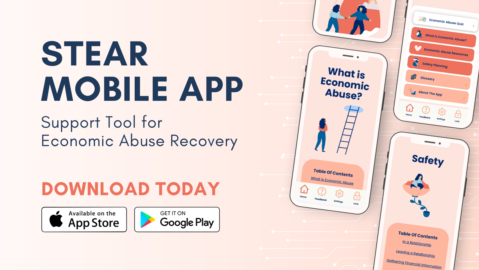
I worked alongside another designer on my team to develop three distinct design directions. Our first explored a pale green and blue palette — finance meets calm. Our second leaned into softer, more feminine tones. Our third pulled directly from the existing CCFWE brand colours — pale pinks and the palette already living in their logo. CCFWE chose the third direction, and from there the real work began.
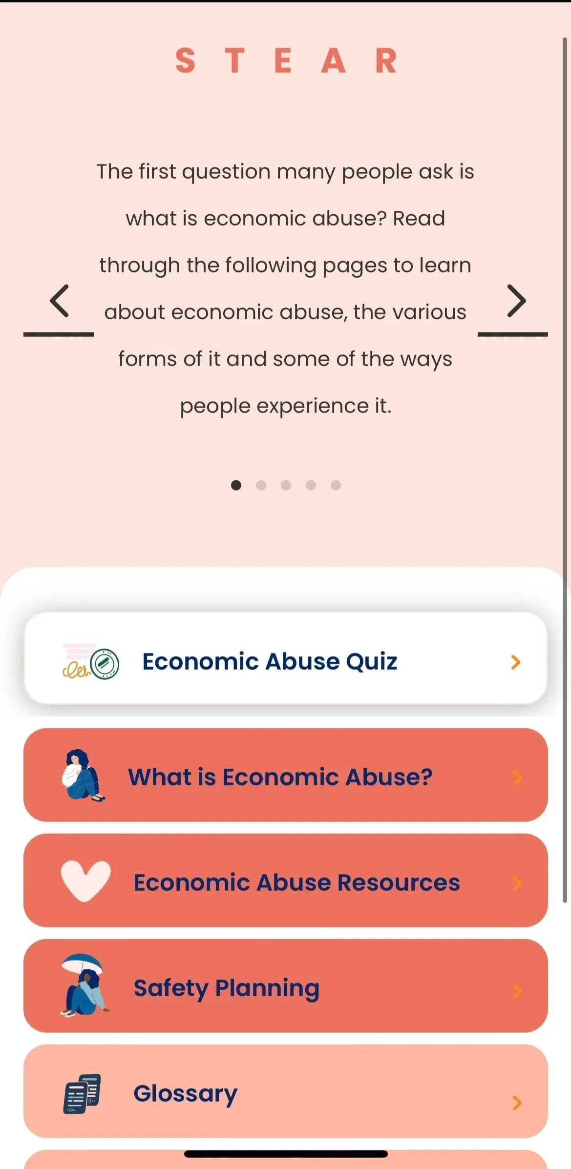
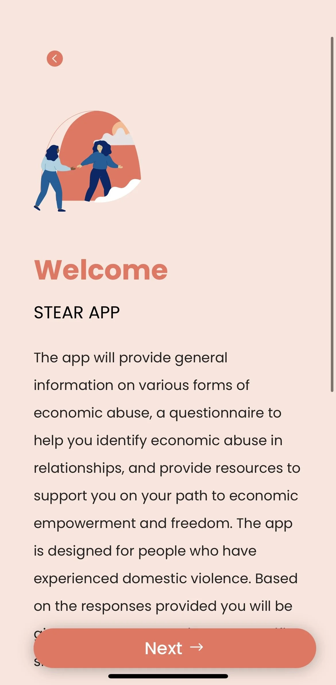
The figurines were a whole journey on their own. Our initial designs didn't land with the client, so I went back to the drawing board — literally. I worked directly with the CCFWE team to explore publicly available Figma illustration packs, manipulating elements and combining parts to create something unique to the brand. Together we landed on a pack created by an illustrator whose work was rooted in feminist design — it felt right for the project in every way. I then customized those figurines to match the brand colours and created unique composite images throughout the app.
Beyond colour and illustration, every other design choice was made with the user's emotional state in mind:
Rounded corners on every single element — nothing sharp, nothing that felt aggressive or clinical
A lock pin on entry so users felt completely secure
Simple, calm iconography
Zero friction anywhere in the experience — if something felt like a barrier, we removed it
The hardest part
Getting sign off. Every round of revisions had to be approved not just by CCFWE's internal team of roughly 6 people — each with their own perspective and stake in the outcome — but then passed along to their external funding partners as well. That's a lot of voices, a lot of opinions, and a lot of moments where I had to stand behind my decisions and explain not just what we did but why. I got very good at defending design choices with clarity and conviction, and at finding solutions that brought a large, diverse group of stakeholders to yes.
The launch
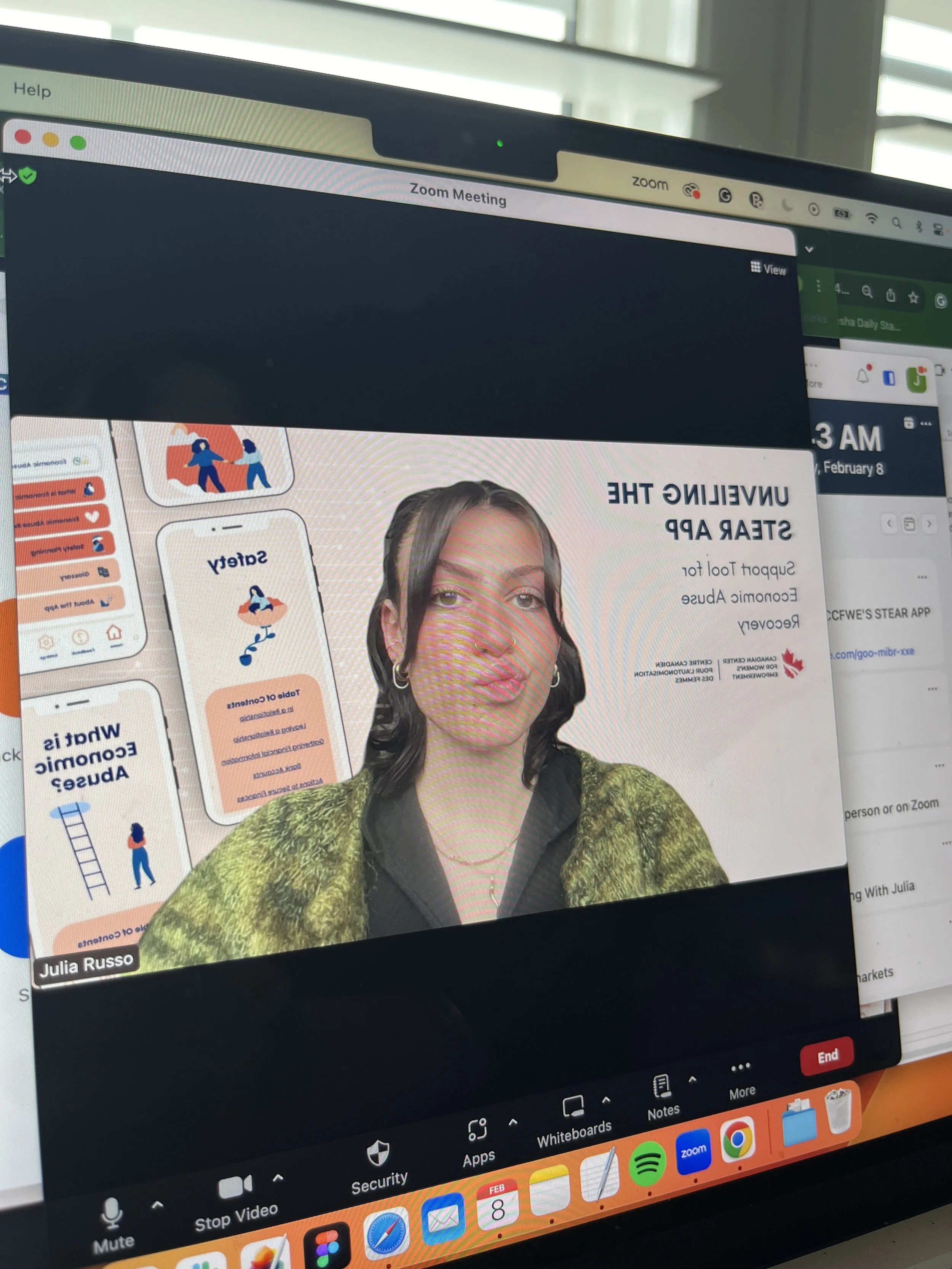
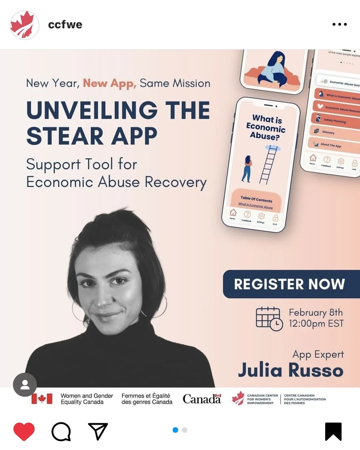
We launched via Zoom — it was still that era just after COVID where large in-person gatherings weren't quite back yet. I presented to a full virtual room: walking through the design decisions, explaining the intention behind every functionality choice, and doing a live walkthrough of the complete app experience. CCFWE introduced me as a speaker and "app expert" on LinkedIn.
CCFWE: STEAR APP Design & Development
UX Design & Development
The brief
CCFWE came to my agency with a clear mission and a lot of heart behind it: build an app that helps individuals recognize and respond to economic abuse — something safe, informative, and genuinely useful for people in vulnerable situations. They knew they wanted a quiz, a resource library, educational content, and above everything else, an experience that felt anonymous and secure. They handed us the vision and trusted us to bring it to life. That's where I came in.
My role
I led this project from the very first design concept to the app store submission and the launch event. I was the designer, the builder, the project manager, the client liaison, and the person standing in front of a room full of stakeholders defending every decision we made. I was also present at every contract meeting — timelines, budgets, renewals, scope. All of it.
Organizing the content
The written content was led by CCFWE's dedicated copywriters — but organizing it, structuring it, and making it feel intuitive inside the app was my job. I categorized everything into buckets that matched how a user would actually think: education, resources, definitions, safety planning, about CCFWE. Then I broke those into subcategories and built the navigation around them. The goal was that someone in a stressful moment could open this app and find exactly what they needed without having to think too hard.
I also managed the translation of all content into 4 additional languages, coordinating with our translation partners to ensure nothing was lost in the process.
The quiz
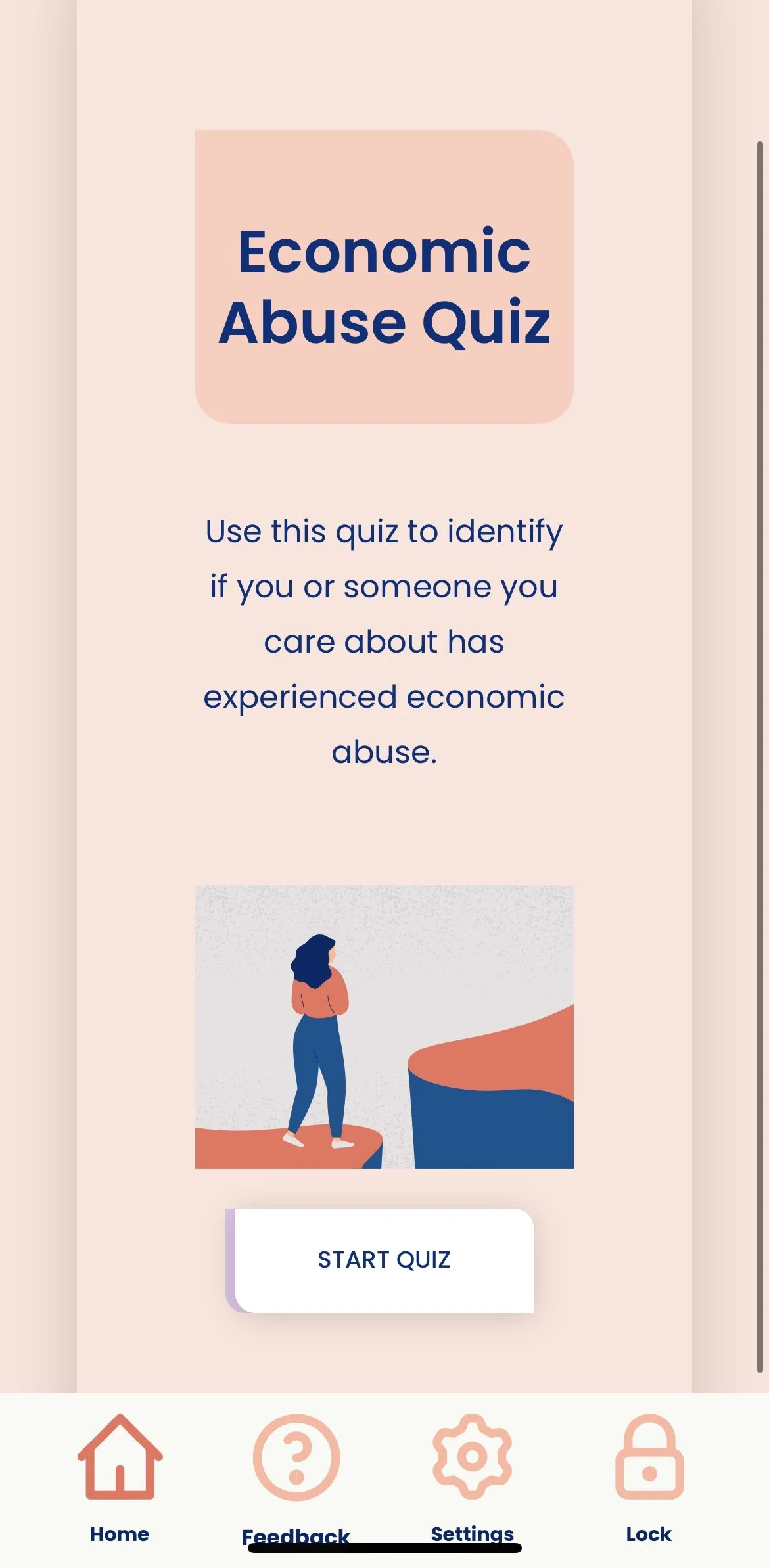
The quiz was CCFWE's idea and a brilliant one at that! My job was to design it and configure the logic behind it. Using a plugin I configured an if/then system: depending on which questions a user answered yes to, the app would surface specific resources most relevant to their situation. The questions themselves were designed to be as low-stress as possible — simple yes or no, no clinical language, no intimidating framing. Just a gentle guide to the right support.
The outcome
Successfully launched on both iOS and Android app stores
Available in 5 languages at launch
500+ downloads within the first 60 days
5.0 star rating on the App Store
Approved through 10+ stakeholder sign-offs across two organizational layers
Adopted by CCFWE as their primary digital resource tool
Turning a rough idea into a product
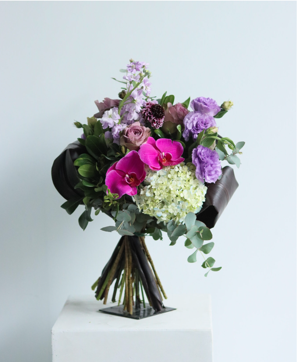
When Pistil Flowers came to us they knew they wanted recurring orders — but the details of what that actually looked like were undefined. My team and I proposed a fully structured subscription model with real parameters: floral theme (modern, garden, or surprise), bouquet size, delivery frequency, vase preference, and a chosen first delivery date that would set the recurring schedule from there. We took their instinct and turned it into an actual product.
The design and content
Pistil Flowers has a house aesthetic that's minimal and confident — the florals do the talking, and rightfully so, because their bouquets are genuinely stunning. The subscription subsection needed to feel like a natural extension of what already existed on the site, not a bolt-on. So we kept the design language consistent: clean, minimal, with the photography front and centre.
For the subscription assets specifically we worked with Pistil Flowers' existing photographer. I was on set with a shot sheet to make sure we captured everything we needed, observing the creative direction to ensure it stayed aligned with the overall marketing message. The photographer led the creative vision — my job was to make sure we left with everything the build required. Once the images came back I organized and placed them within the subscription section design to bring the whole thing to life.
Pistil Flowers Subscriptions
Digital Strategy & Web Development
The build — and where it got hard
We started with a plugin. That was the plan. But as we got deeper into the project Pistil Flowers' requirements evolved — things we hadn't accounted for at kickoff that the plugin simply couldn't handle. We made the call to move to custom coding and brought in a contract developer to help execute it.
This is where the project got complicated. Custom code is unpredictable — something would be built, then look broken. Requirements would shift, and the code would have to shift with them. We were working against a tight budget and every change cost time and money.
What actually solved it was a sit-down with the Pistil Flowers team to get brutally honest about needs versus wants. What absolutely had to be there for this to function? What was nice to have but not worth the risk of breaking everything? That conversation reset the project and gave us a clear path to the finish line. We delivered within budget — but it took discipline and straight talk with the client to get there.
The problem I solved mid-launch
Once the subscription was live I noticed something the initial build hadn't accounted for: there were no controls on where orders could be delivered or when. Customers could technically place orders outside the delivery zone or without enough lead time for the team to fulfill them. I worked with the developer to implement geo-blocking outside the serviceable area and calendar logic that required a minimum 3-day lead time between order and first delivery. It protected the client's ability to actually deliver on what they were selling.
The outcome
Subscription model launched within budget after 5 months of development
40+ active subscriptions within the first 3 months of launch
60% of subscribers on the commercial/office tier
Geo-blocking and calendar logic eliminated fulfillment errors post-launch
Client reported increased revenue predictability through recurring subscription model
Custom coding solution delivered without scope creep through disciplined needs vs. wants prioritization
The brief
Pistil Flowers came to us with a rough but exciting idea: they wanted a way for customers to order their florals on a recurring basis. Their commercial clients — offices that love having fresh flowers in their lobbies and reception areas — were the primary audience, with a secondary focus on higher-end individual clients who wanted that same luxury at home. The concept was there. My job was to shape it into something real.
My role
I owned this account completely. I was the strategist who helped define what the subscription actually was, the project manager who kept it on time and on budget, the content creator who built the pages, the person on set during the photography shoot, and the client liaison who had the hard conversations when they needed to be had. Start to finish, five months, this was mine.
How I measure success
Post-launch I dig into Adobe Analytics to assess application start rates per product, application completion rates, page traffic volume, traffic sources, time on page, and click-through rates. These tell me not just whether the campaign performed — but what I'm changing next quarter.
The outcome
2 solo campaigns delivered on time and on brief
Average page traffic up 31% during active campaign periods vs. baseline
Application start rate for Relationship Checking up 24% QoQ
Berkeley segment pages consistently outperforming general audience on CTR
Click-through rate improvements quarter-over-quarter are driven by iterative copy and design testing
bmo.com us deposits - quarterly campaigns
UX Design & Development
The brief — My job is to drive acquisition for BMO's US checking and savings products through quarterly campaigns targeting distinct customer segments — coordinating across marketing, legal, design, development, and QA to make it happen.
My role — I'm the sole digital owner of the full campaign lifecycle. Kickoff to launch, every quarter, across three products and multiple audience segments.
The products & offers
Three products, three offer tiers running simultaneously each quarter:
Smart Money — $400 bonus
Growth Money Market — $560 bonus
Relationship Checking + Growth Money Market — $1,000 bonus (bundled offer)
The segments
My campaigns are tailored to distinct audiences. The Berkeley University partnership alone spans three unique page experiences — students, employees, and alumni — each with tweaked copy and messaging to match where that person is in their relationship with BMO, built in collaboration with my personalization team.
How I make a campaign
Every quarter starts with a marketing partner kickoff — I need to understand the promotional goals, the offer parameters, and what physical advertising will be running in market so the digital experience matches. From there I own everything:
I brief the UX/UI team and collaborate in Figma on fresh designs and copy decks for each page. I run 3-4 rounds of review with marketing partners — presenting, revising, reworking — until the creative is locked. I send to legal for compliance review while simultaneously scoping any development requirements (module updates, promo code generation, form builds). Once approvals land I build the pages in the CMS backend myself. I create QA links for designer and content sign-off, coordinate with the QA team on functionality testing, run a live walkthrough with all stakeholders, and finally queue the launch with developers.
Five pages. Every quarter. Every step mine.